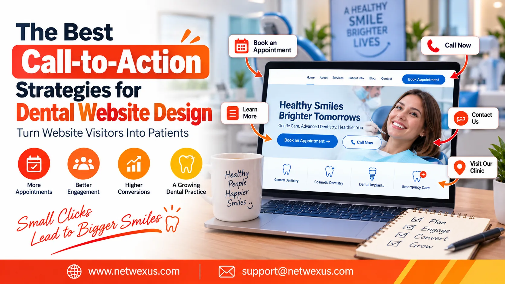
A dental website has one primary goal beyond providing information: turning website visitors into patients. A potential patient may arrive on your website after searching for a dentist, reading about a specific treatment, or looking for a convenient clinic nearby. However, simply providing useful information does not guarantee that the visitor will contact your practice or schedule an appointment. This is where effective calls to action, commonly known as CTAs, become essential.
A well-designed call to action tells visitors what they should do next. Whether the goal is to book a dental appointment, call the clinic, request a consultation, contact the dental team, or learn more about a treatment, the CTA should be clear, visible, and relevant to the visitor’s needs. When incorporated correctly, CTAs can significantly improve the user experience and help dental practices generate more valuable leads.
For dental practices investing in dental website design, CTA strategy should be considered from the beginning rather than added as an afterthought. The placement, wording, color, size, surrounding content, and destination of every CTA can influence how visitors interact with the website.
Why Calls to Action Matter in Dental Website Design
Many dental websites receive visitors who are interested in treatment but are not sure what to do next. A visitor might read an implant page, explore cosmetic dentistry services, or check the dentist’s credentials and then leave because there is no obvious next step.
An effective CTA removes this uncertainty. Instead of making visitors decide where to go, the website guides them toward a useful action. For example, a treatment page could include a “Book an Appointment” button after explaining the service, while a contact section could encourage visitors to “Talk to Our Dental Team.”
CTAs also create a smoother patient journey. Visitors can move naturally from discovering a service to learning about it and then taking action. This makes CTA optimization an important part of conversion-focused dental website design.
1. Use Clear and Action-Oriented CTA Text
One of the simplest ways to improve a dental website’s CTAs is to use direct, action-oriented language. Generic phrases such as “Click Here” or “Submit” do not tell visitors what will happen when they click.
Instead, use wording that clearly communicates the intended action. Examples include “Book Your Appointment,” “Schedule a Consultation,” “Request an Appointment,” “Call Our Dental Office,” and “Explore Dental Treatments.”
The best wording depends on the purpose of the page. A service page should encourage visitors to take a relevant next step, while a contact page can focus on contacting the practice. Clear language reduces hesitation and helps users understand what they can expect.
2. Make the Primary CTA Highly Visible
A strong call to action is not useful if visitors cannot find it. Dental websites should make their primary CTA visually noticeable without making the design look cluttered.
The main appointment button can be placed prominently in the website header so visitors can access it from almost any page. Additional CTAs can appear within the homepage, treatment pages, blog content, and contact sections.
Visual hierarchy is important. The primary CTA should stand out from secondary links and buttons. However, excessive use of bright colors, animations, or oversized buttons can make the website feel unprofessional. The goal is to attract attention naturally while maintaining a clean design.
3. Add Appointment CTAs Above the Fold
The area visitors see before scrolling is commonly referred to as the “above-the-fold” section. This is valuable space because it creates the first impression of the dental practice.
A strong homepage can introduce the practice, communicate its primary benefit, and provide a clear CTA within this initial section. For example, a headline explaining the practice’s services can be accompanied by a prominent “Book an Appointment” button.
This does not mean every piece of information must appear above the fold. Instead, visitors should immediately understand who the practice serves and have an obvious way to take the next step.
4. Create Service-Specific Calls to Action
Not every visitor arrives at a dental website for the same reason. Some may be interested in general dentistry, while others may be researching dental implants, orthodontics, cosmetic dentistry, or emergency dental care.
Using the same CTA everywhere can make the website feel generic. Instead, match the CTA to the content and visitor intent.
For example, a dental implant page might use “Schedule an Implant Consultation,” while a cosmetic dentistry page could use “Explore Your Cosmetic Options.” This approach creates a stronger connection between what the visitor is reading and the action they are encouraged to take.
5. Use Click-to-Call Buttons for Mobile Visitors
Mobile optimization is a critical part of modern dental website design. Someone searching for a dentist from a smartphone may prefer calling the practice rather than completing an online form.
A click-to-call button makes this process much easier. Instead of copying a phone number or switching applications, visitors can simply tap the phone button to contact the practice.
The phone number should be easy to find, especially on mobile devices. A website can also provide both options: “Call Now” for visitors who want immediate assistance and “Book Online” for those who prefer digital scheduling.
6. Place CTAs Throughout Long Service Pages
A common mistake is placing one CTA at the bottom of a long page and expecting every visitor to reach it. Long treatment pages can contain thousands of words, meaning many visitors may decide to contact the practice before reaching the end.
Strategically placed CTAs provide multiple opportunities to take action. A service page can include a CTA after the introduction, another after explaining the benefits or treatment process, and a final CTA near the conclusion.
These CTAs should feel natural and should not interrupt the reader excessively. Their purpose is to provide a convenient next step when the visitor is ready.
7. Use Trust-Building Content Near Your CTAs
Visitors may hesitate to book an appointment if they are uncertain about the dental practice. Adding trust signals near important CTAs can help reduce this hesitation.
Testimonials, dentist credentials, professional photographs, patient-focused explanations, clinic information, and relevant reviews can all help establish confidence. After providing this information, a CTA such as “Schedule Your Visit” gives the visitor a clear next step.
The combination of useful information, credibility, and a relevant CTA creates a stronger conversion path than simply placing a large button on the page.
8. Optimize CTAs for Local Dental Patients
Dental practices generally serve a specific geographic area, making local intent particularly important. Visitors may search for terms such as “dentist near me,” “emergency dentist,” or “dentist in [city].”
Your website should make its location and contact information easy to find. CTAs can also emphasize convenient local action, such as “Book a Visit at Our [City] Dental Office” or “Contact Our Local Dental Team.”
Location-specific CTAs should remain natural and useful rather than becoming keyword-stuffed. The objective is to make it clear where the practice is located and how potential patients can contact it.
9. Keep Appointment Forms Simple
A CTA that leads to a complicated appointment form can create unnecessary friction. If visitors click “Book an Appointment” but are immediately confronted with a long form containing many unnecessary fields, they may abandon the process.
Keep appointment forms as simple as practical. Ask for the information needed to begin the booking or inquiry process and avoid unnecessary questions.
The form should also be easy to complete on smartphones. Large input fields, readable labels, clear error messages, and a simple submission process can make a significant difference to the overall user experience.
10. Use Different CTAs for Different Stages of the Patient Journey
Not every website visitor is ready to schedule an appointment immediately. Some visitors may be researching a dental treatment for the first time, while others may already be comparing practices.
A successful dental website can use different CTAs based on the visitor’s stage in the decision-making process.
Someone who is researching a treatment may respond better to “Learn More About Dental Implants,” while someone who has already decided to seek treatment may be ready for “Book an Implant Consultation.”
This approach allows the website to guide visitors gradually rather than asking every visitor to make the same decision immediately.
11. Make CTAs Consistent Across the Website
Consistency is another important element of effective dental website design. If the appointment button looks different on every page, visitors may have difficulty recognizing the primary action.
Use consistent button styling, typography, spacing, and terminology throughout the website. If the primary action is “Book an Appointment,” avoid changing it randomly to “Schedule Now,” “Make a Booking,” and “Reserve Your Visit” unless there is a specific reason.
Consistency creates familiarity and makes navigation easier for visitors.
12. Avoid Too Many Competing CTAs
Adding more buttons does not necessarily generate more conversions. In fact, too many competing calls to action can make a page confusing.
A page might contain buttons for booking, calling, downloading a guide, reading reviews, viewing services, joining a newsletter, and contacting the practice. When everything is emphasized, nothing feels like the primary action.
Instead, identify the most important action for each page. Make that CTA the primary focus and keep secondary actions visually less prominent.
13. Test Different CTA Strategies
Even experienced dental marketers cannot always predict which CTA will perform best. Testing different approaches can provide useful insights into visitor behavior.
Dental practices can experiment with CTA wording, button placement, page sections, form length, and supporting content. For example, one version of a page might use “Book an Appointment,” while another uses “Schedule Your Dental Visit.”
Performance can then be evaluated using relevant metrics such as appointment requests, phone calls, form submissions, and engagement. Changes should be made based on meaningful data rather than assumptions.
14. Make CTAs Accessible to All Visitors
Accessibility should be part of every professional dental website design strategy. CTAs should be easy to read, identify, and interact with.
Buttons should have clear text, sufficient visual contrast, appropriate sizing, and enough spacing to prevent accidental clicks. Visitors navigating with keyboards or assistive technologies should also be able to interact with important website controls.
An accessible website creates a better experience for a broader range of potential patients while supporting a more professional online presence.
15. Connect CTA Design With Overall Dental SEO
Calls to action primarily focus on conversions, but they should also work alongside the website’s SEO strategy. Strong SEO brings relevant visitors to the website, while effective CTAs help guide those visitors toward useful actions.
Individual treatment pages should target relevant search intent and provide useful information before presenting an appropriate CTA. Internal links can also guide visitors from informational blog posts toward relevant service pages.
For example, an article about the benefits of dental implants could naturally link to an implant service page, where visitors can find detailed treatment information and an appointment CTA.
This creates a connected website structure that supports both search visibility and user experience.
How to Create a High-Converting Dental CTA Strategy
Creating an effective CTA strategy does not require dozens of buttons or complicated technology. Start by identifying the primary goal of each important page. For the homepage, this may be scheduling an appointment. For a treatment page, it could be requesting a consultation. For a blog post, it may be visiting a related service page.
Next, create concise CTA wording that matches the visitor’s intent. Make the primary action visually recognizable and place it where visitors naturally make decisions. On mobile devices, make sure buttons are easy to tap and phone numbers are clickable.
Finally, measure the results and continue improving the strategy. A dental website should evolve as patient behavior, services, and business goals change.
Final Thoughts
Effective calls to action are an essential part of successful dental website design. They help visitors understand what to do next, simplify the patient journey, and create more opportunities for appointments and inquiries.
The best dental website CTAs are clear, relevant, visible, mobile-friendly, and supported by useful information. Rather than filling every page with aggressive sales messages, focus on guiding visitors toward the next logical step.
By combining strong CTA wording with responsive design, simple appointment forms, trust-building content, local SEO, and consistent testing, dental practices can create a website that not only looks professional but also works as an effective patient acquisition tool.